Better support for mobile browsers and four added translations.
7 March 2023Small screens have better support and four new translated sermons have been added.
The four translated sermons are:
- Ik ben het, vreest niet (It is I, be not afraid)
- Het onzekere geluid (The uncertain sound)
- Abraham en zijn zaad na hem (Abraham and his seed after him)
- Jezus Christus is gisteren en heden Dezelfde en in eeuwigheid (Jesus Christ the same yesterday, today, and forever)
The website now has a “responsive” design, which means that it adapts to screens of different sizes.
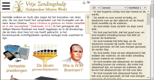
There are three layouts; the old layout for computer monitors is almost identical to the old, except for the new menu icon for settings.
There are three layouts; the old layout for computer monitors is almost identical to the old, except for the new menu icon for settings.

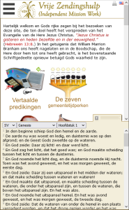
Two layouts have been added for mobile browsers, depending on the orientation of the display it will switch between landscape or portrait layouts. The menu expands vertically in both versions and has a larger surface area per menu option so that it is easier to navigate with fingers.
In both mobile layouts the Bible now divides the screen inwardly instead of extending to the outside. In landscape mode it remains on the right hand side.

In portrait mode it moves to the bottom half of the screen.

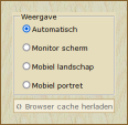
If you prefer the old layout or you would like to prevent the layout from switching while changing orientation, it is possible to set a fixed layout in the new settings pane.
Note that these settings are stored locally in your browser as a cookie and are not stored on our server, so if you use private browsing your settings will only last for the current session.
Note that these settings are stored locally in your browser as a cookie and are not stored on our server, so if you use private browsing your settings will only last for the current session.


If the site does not look correct, please click on the button below to clear your browser cache: